Buttons are essential components in any user interface (UI). Whether you’re designing a website, app, or digital product, buttons guide users to take action. In this guide, we’ll walk through creating a simple, professional button in Figma from scratch. Let’s dive in!
Why Use Figma for Buttons?
Figma is a versatile, cloud-based design tool that makes creating and prototyping UI elements like buttons effortless. With features like reusable components, easy collaboration, and a user-friendly interface, Figma is perfect for designing scalable UI elements.
Step 1: Setting Up Your Figma File
- Open Figma: Start by creating a new Figma file or opening an existing project.
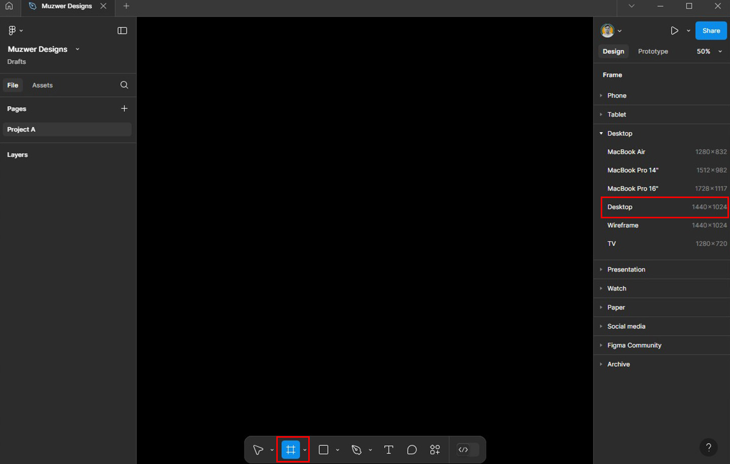
- Create a Frame: Press
Fon your keyboard or use the Frame tool from the toolbar. This will be your workspace for designing the button.
Step 2: Drawing the Button Shape
- Select the Rectangle Tool:
- Click the rectangle tool (
R) from the toolbar. - Drag to draw a rectangle on your frame. This will be the base shape of your button.
- Click the rectangle tool (
- Adjust the Size:
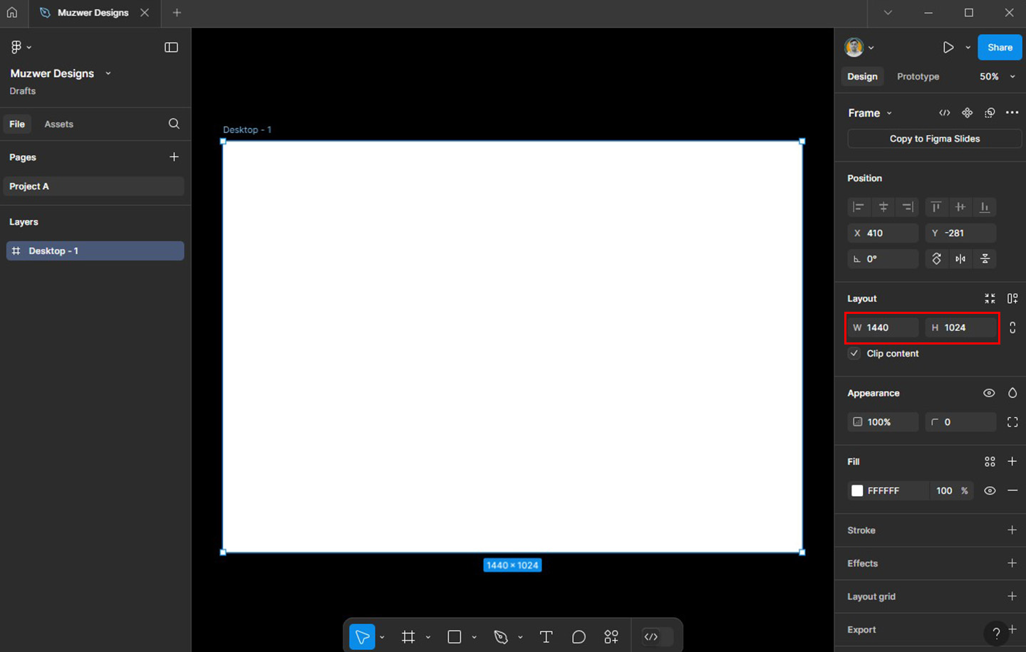
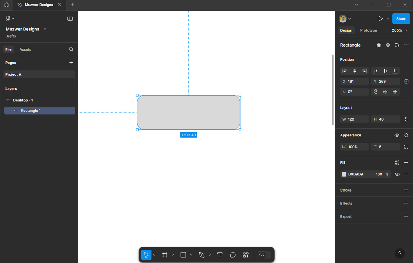
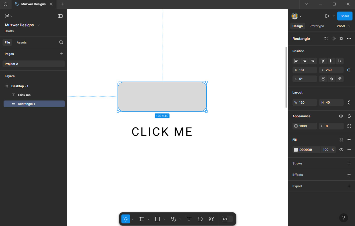
- A standard button size is around 120px width and 40px height, but you can customize it based on your design.
- Round the Corners (Optional):
- For a softer look, adjust the corner radius. Select the rectangle, go to the properties panel, and set the corner radius to
8pxor any value you prefer.
- For a softer look, adjust the corner radius. Select the rectangle, go to the properties panel, and set the corner radius to
Step 3: Adding Text to the Button
- Use the Text Tool:
- Press
Tor select the Text tool from the toolbar. - Click inside the button shape and type the button label (e.g., “Click Me”).
- Press
- Style the Text:
- Choose a font that aligns with your design theme (e.g., Inter or Roboto for modern UIs).
- Set the text size to around 16px for readability.
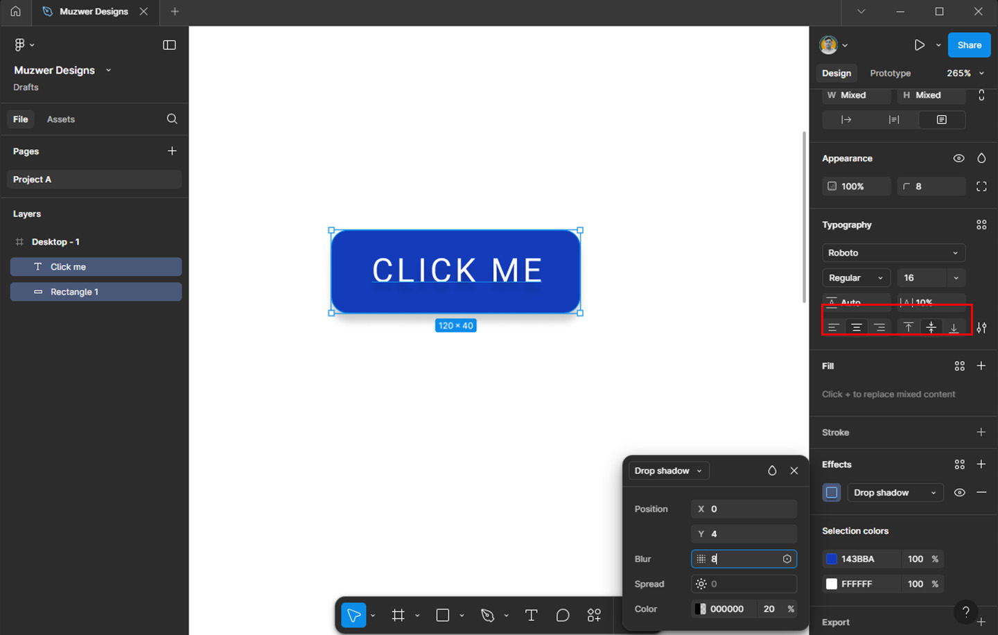
- Align the text to the center of the button by selecting both the rectangle and text, then using the alignment tools in the top-right corner.
Step 4: Adding Color
- Button Background:
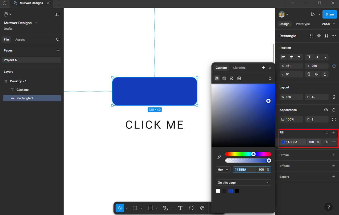
- Select the rectangle and go to the Fill section in the properties panel.
- Choose a primary color that matches your design palette (e.g., blue for a primary action button).
- You can also add a gradient for a more dynamic look.
- Text Color:
- Set the text color to contrast with the background. For instance, if the button is blue, white text works well.
Step 5: Adding Shadows (Optional)
To make your button stand out, add a subtle shadow:
- Select the rectangle.
- In the properties panel, click Effects and choose Drop Shadow.
- Adjust the shadow’s
Y-offset,Blur, andOpacityfor a soft effect. A common setting isY: 4px,Blur: 8px, andOpacity: 20%.
Step 6: Grouping the Elements
- Select the rectangle and the text.
- Right-click and choose Group Selection (or press
Ctrl+G/Cmd+G). - Rename the group as “Button” for better layer organization.
Step 7: Turning the Button into a Component
Creating a component allows you to reuse the button across your design:
- Select the grouped button.
- Click the Create Component button in the toolbar (or press
Ctrl+Alt+K/Cmd+Option+K). - Now, you can drag and drop this button from the Assets panel anytime you need it.
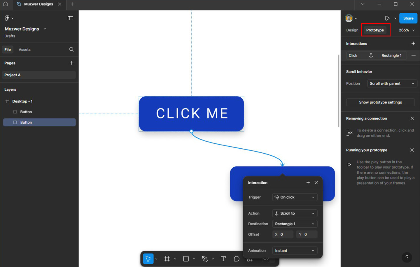
Step 8: Prototyping the Button
To simulate button functionality:
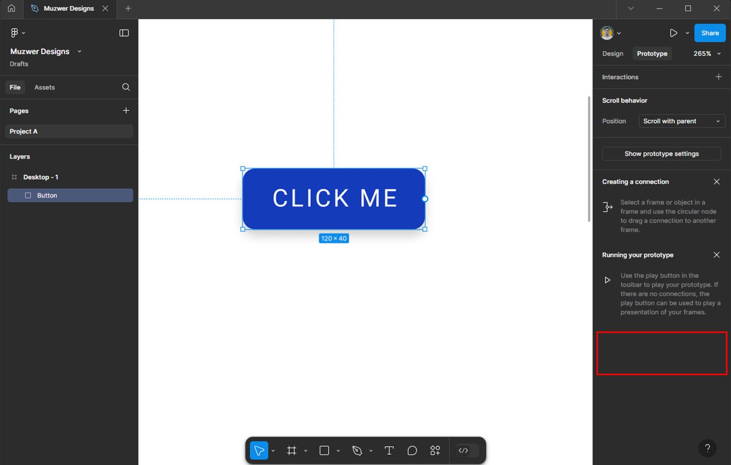
- Go to the Prototype tab.
- Click on the button and drag a blue connection arrow to the desired frame or screen.
- Choose an interaction (e.g., “On Click → Navigate To”).
Tips for Better Buttons
- Use consistent spacing: Ensure padding between the text and button edges is uniform (e.g., 12px top and bottom, 24px left and right).
- Add hover and pressed states: Duplicate your button and adjust the styles (e.g., darker shade for hover, lighter shade for pressed).
- Test readability: Ensure your button text is clear and legible across all screen sizes.
Final Thoughts
Creating a button in Figma is straightforward yet impactful for your design workflow. With reusable components and a flexible interface, Figma allows you to streamline the process while maintaining creativity. Experiment with styles, colors, and interactions to make your buttons truly engaging!
Now it’s your turn—open Figma and start designing your button today. Happy designing!
